Posts

My intro to Kaggle

Image
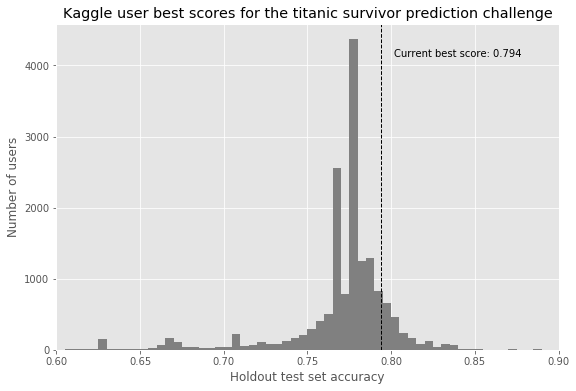
Anyone who has peaked into the worlds of data science or machine learning is likely to have heard of 'Kaggle'. They've been a resource for curated machine learning datasets for a number of years, and are becoming a hub for learning about, talking about, and practicing machine learning. I spent a short while working my way through the short but highly interactive courses on the Kaggle site, and found these to be terrifically rewarding and engaging. The next step from working on any of these courses is to try your hand at a competition hosted on the site. The titanic competition is the most famous and likely the most accessible of these endeavours. The titanic competition provides a number of features about the passengers of the titanic, and asks entrants to predict survival based upon what is known. The features are as follows: Variable Definition Key survival Survival 0 = No, 1 = Yes pclass Ticket class 1 = 1st, 2 = 2nd, 3 = 3rd sex Sex...

Simple to start - following interesting data to its conclusions

Image
The current iteration of this post is from 2019-10-24 This project started after I came across a visualisation of the  years of income needed to pay off a house across counties in the U.S. (assuming median house price and median income per region). This seemed like an achievable visualisation, and something I could do. It compelled me to start this blog to record my own projects trying to answer questions using data. That post is a straightforward visualisation using a combination of simple statistics but the data highlights striking differences in relative costs of acquiring a home in the United States. As a resident of the UK, my first obvious question was what does this look like for the UK? From combining the data with what little I know of the U.S.'s geography, peaks in the data appear to correlate with the locations of large cities - so how well does this data correlate with population density? Are there other meaningful correlations that can be drawn? Do such corre...